Thursday, 25 October 2012

Week 7 - Photography

Photography - Task 2


The second task for photography was to go into Chesterfield and take photographs with interesting composition or situations. For example, diagonal lines going across the picture would work well as it can draw your eye to something. I took a series of 15 photos then edited them slightly on Photoshop to change the lightness and darkness. See the video above to view my photos.

I really enjoyed the photography week although it was shortened down to a couple of days due to artist speaches within college. I would have liked to have done more activities but i am pleased with what i have come out with within these few days.

Week 7 - Life Drawing

Life Drawing - Week 7


The seventh week of life drawing was working with colour, this time, acrylic paints. However, as i missed the first part of the lesson i decided to do a quick pencil drawing of the life model just to get me started.


The colours we were working with to begin with were blue and yellow, and obviously the colour green which could be made by mizing these colours. I bagan by applying the yellow to the lighter areas then the blue to the shaddowed dark areas. This helped me to then find the mid-tones on the life model where i could use watered down blue paint to mix with the yellow.


For my third piece i added an extra colour, brown, to use. I found this easier as i could create really dark areas by adding the blue and brown to create an almost black colour. I worked in the same was as my previous drawing however i found that with this method i tried working too 'neatly' whereas i think my outcome would have looked better if i just got in to it more.


My final painting was using more of a variety of colours, yellow, blue, brown, red and white. The white really allowed me to create more colours. I was able to create lots of flesh toned colours with the red and white then adding a little yellow. With this final painting i decided to use less water to water my colours down and just apply thick paint, this meant the colours merged together more but i really liked the effect it created and you could see which way the brush strokes went in. Although the blues and greens created are not the exact colours i saw on the life model they work really well and give my painting a different and interesting look.

Week 7 - Photography

Photography - Task 1


The first task was to use film cameras to take portraits. The idea was to take the photo when we least expected it. In groups of 4 one person would have their photo took by another person whilst the other 2 asked questions, any questions at all. The photo would then be taken whilst we were talking instead of just having a normal smiling photograph. This task was really enjoyable as our photographs we're quite funny once we had the film developed. We were to create a contact sheet of our film strips on photo sensetive paper. We allowed different amounts of time to go on to the paper by moving a sheet of card across it, (so some of the paper had 3 seconds of light on it whereas some of it had 18 seconds).


Experimenting with photograms is something i really enjoyed too. In this one i used a small decorative glass bowl with lots of engravement and ridges in it. The pattern created on the photogram was lovely to look at as the light was obviously reflected through all the glass pieces, creating this interesting image.


I used another glass bowl in this photograp but placed it so only half of it was showing, just for a different composition.


In this photograp i tried to move the object along as the light shone. The outcome was quite disapointing but it is something i can say i have experimented with.


I used a five pound note on this photograp however it just created a white block.


This is my favourite outcome out of all my photograms as i can really tell what the objects are. I used a lighbulb, my ring, and some netted material. Using more than one object gave it a good composition and obviously more to look at.

Wednesday, 24 October 2012

Week 6 - Illustration

Illustration - Task 3


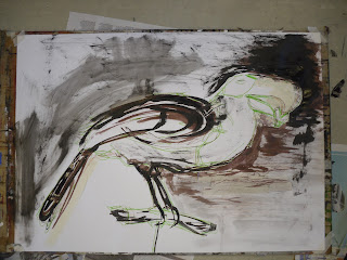
After the drawing tasks and the Graphic Design workshop the next task was to create a 3D copy of our bird (in my case, a tucan) out of two of our previous drawings and newspaper. I began by making the body shape with the head then attaches paper for the beak and tailfeathers. 


We were to hang our paper bird from the ceiling to work from. I began by creating a collage with my left over paper. I didnt want to just create an outline of the bird therefore picked out the most obvious parts such as the beak, body and tailfeather. I even used some parts to create a slight background effect.


I sprayed my collage with water and then worked over the top of it with brown ink on a stick. This defined the rest of the shape of my paper bird.


I worked back into the background and the collage with brown ink and white emulsion.


My second drawing began by using a candle stick to draw my paper bird. I found this difficult as the wax from the candle barely shown up on the paper. After washing it over with brown ink it was much clearer and i could see the proportions we're quite wrong.


I used brown ink on a stick to work into my drawing. This time i decided to look more at the patterning from my drawings on my paper bird and apply them to this drawing.


I used the brown ink to change the shape and proportions to my drawing. White emulsion was effective to erase parts that didn't look corect.


I used black and blue ink to add the finishing touches of correcting my drawing. The effect of the ink dripping down my page was something i really liked. I used the black ink to also add more of the patterning from the paper on my bird to this drawing, it really helped make it stand out.

Week 6 - Graphic Design Workshop

Graphic Design Workshop - Week 6


The graphic design workshop was something I was very eager to do. I thoroughly enjoyed the graphic design taster week therefore thought the workshop would be just as interesting. The task was to reinterpret the Union Jack. I began by looking in home furniture magazines at pieces with the Union Jack on such as cushions and bed spreads. I photocopied these large for the patterning. I used various photocopies and arranged them on graph paper in the traditional shape of the Union Jack. I found that the colours were still very reddish and blueish which i thought made it obvious it was the Union Jack. To change this i played around on the photocopier to see what other designs i could come up with. 

The first idea was pretty simple as i got rid of all the colour and made it black and white. Although it was different i wasnt so pleased with it.


I switched the colours over so that white's changed to black's and vice versa. I think this made the image more 'in your face' and obvious than before but it could be better.


This was something i made by accident by switching the colours. The one thing i really liked was how the graph paper was still noticable but it was a dark orange/red colour. The colours were all different to the typical blue red and white therefore i chose this as my final outcome.

The workshop was something i really enjoyed even though it was for a short space of time. It was interesting to work with the Graphic Designer who gave us a speach on his busness, Lethal.

Week 6 - Illustration


Illustration - Task 2

The main task for the Illustration project was a drawing task. We were working with museum birds, in my case, a tucan. I began with a simple ink drawing however i was to use a stick to draw with that was approximately a metre long. This really took away my control within my drawings. I then used a blue felt pen attached to the end of my stick to correct my drawing with proportions etc. I sprayed my drawing with water which made the ink and blue pen run into eachother and create really 'crispy' lines.
  

I kept working back in to my drawing with ink whilst the paper was still wet, this made the ink run/smudge even more.


The background was something i wanted to consider therefore i drew a line to represent the plastic box the bird was in.


Working on an ink wash background was something i found much easier as it gave me something to begin with and gave my drawing a background. I used the same method of attaching my tools to the end of a metre stick to make my drawing less controlled.


I got into the habbit of drawing the bird rather small on my paper therefore i used blue ink to then work with the original outline to make the bird much larger.


I wanted to work more into my background again therefore used the edge of the plastic box and represented it with blue ink.

 
I wanted to look at the bird from a different angle to show different compositions within my drawings.


I used tape to get rid of the lines that i drew in wrong accidently. This added to my drawings and gave me something to work from.


Adding more to my background was interesting as it made parts of the bird stand out more.


This was my favourite outcome just for the fact i thought my drawing was more realistic, however, this was not the aim of the lesson. I like how i looked into the background more, something at first i didn't consider.


As the aim of the lesson was to have 4 final outcomes/drawings, i had to quickly draw up my fourth one as i missed the end of the lesson due to attending the graphic design workshop. I used ink and a paintbrush to create a quick sketch.

Week 6 - Illustration - Illustrator Research - Ronald Searle

Illustrator Research - Ronald Searle


Ronald Searle was born on 3 March 1920 – 30 December 2011. He was a British artist and satirical cartoonist/illustrator.

Ronald Searle's work is something i can relate to my won as they look very detailed and worked in to.


Week 6 - Illustration

Illustration - Task 1


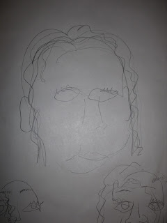
The first practical task was a drawing task. We had to have our eyes closed and draw our faces by touching and feeling it ourself. This was interesting as it encouraged me to draw just lines and obviously no tones or shades as i was unable to see the light on my face. Obviously my drawing was really out of proportion but i quite liked that look it had, it enabled me to loosen up my drawings.


Altogether we did three experiments with this method, sometimes we used one continuous line throughout the drawing, i found this made it harder as i had to remember which bit i was drawing at all times.


I think my drawings have quite a querky look to them and there is something which makes them look interesting and almost funny.


Another drawing task was observing different types of shoes. We worked with graphite, brown felt pen and grey felt pen. We drw in continuous lines and some drawings i made bigger than others so that my sheet of paper was mostly full.


We worked with the same shoes but this time we was unable to look at what we were drawing as we covered our sheet of paper. I found this difficult as i am really used to seeing what i am drawing and where i am drawing it. It was interesting to see the difference in my drawings.


I enjoyed when we was able to use our correct hands and draw in detail as this is something i enjoy the most when it comes to drawing.


The final drawing task was to use our left hand however we had longer time therefore i could focus more on the object and the detailing. As a final drawing i am pleased with the outcome as i think the composition works well and the mixed media draws your eyes to certain things.

Tuesday, 16 October 2012

Week 6 - Illustration - Illustrator Research - Sara Fanelli

Illustrator Research - Sara Fanelli


Sara Fanelli is an artist and illustrator who was born in Florence in 1969. She came to London to study art at the Camberwell College of Art and then the Royal College of Art where she graduated in 1995. She uses her time between illustration work, books and her own personal projects. She has written and illustrated children’s books which have been published in many languages and have earned her international awards and commendations. 


I find her work very sketchy and un-realistic yet you can still see what the image/illustration is of. I like how backgrounds are also worked in to and considered for the illustration. With them being neutral colours they make the illustration stand out and be more noticeable to the audience. The text used within her work is something i am really fond of as i have enjoyed working with text in graphic design and i would even consider using text within my own illustrations which i could then refer back to this illustrator.

Week 6 - Life Drawing

Week 6 - Life Drawing


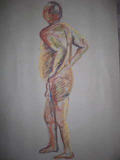
The sixth week of life drawing was based around using colour within our work rather than black and grey tones. However, I didn't use correct skin toned colours such as pinks/browns as my colour palette consisted of contrasting colours that wouldnt normally be used for skin tones (blues,reds,greens,yellows). I found my first drawing quite difficult but once i had the basic outline and light/dark areas shaded in it began to fall into place.


My second drawing is slightly out of proportion but the colour use was much better from practise.


I found it easier to work on a larger scale as i had more space to work on. I think this drawing could use more obvious darker areas.


I am pleased wit this drawing as an outcome as i used most of my selected colours, which actually works better than using fewer colours.


I really enjoyed the life drawing lesson as colour was something we haven't previously worked with so it was interesting to try new techniques.